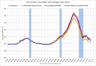
Below is a great graph from Calculated Risk, which provides visual evidence that the housing market is going to rebound. The graph shows the price-to-rent ratio between the cost to own a home versus renting. The higher the higher the ratio, the more expensive it is to own a home. Looking at this graph, the housing bubble is easy to see. The ratio is approaching levels last seen in the late 1990s, indicating that home ownership is nearly as cheap as renting.
The graph also ties in with my previous post on AIG. If AIG is looking for large multifamily development investments, it's probably a sign that large multifamily projects are near a top.
Friday, April 13, 2012
Subscribe to:
Post Comments (Atom)

No comments:
Post a Comment